What's new in Matplotlib 3.10.0 (December 13, 2024)#
For a list of all of the issues and pull requests since the last revision, see the GitHub statistics for 3.10.1 (Feb 27, 2025).
New more-accessible color cycle#
A new color cycle named 'petroff10' was added. This cycle was constructed using a combination of algorithmically-enforced accessibility constraints, including color-vision-deficiency modeling, and a machine-learning-based aesthetics model developed from a crowdsourced color-preference survey. It aims to be both generally pleasing aesthetically and colorblind accessible such that it could serve as a default in the aim of universal design. For more details see Petroff, M. A.: "Accessible Color Sequences for Data Visualization" and related SciPy talk. A demonstration is included in the style sheets reference. To load this color cycle in place of the default:
import matplotlib.pyplot as plt
plt.style.use('petroff10')
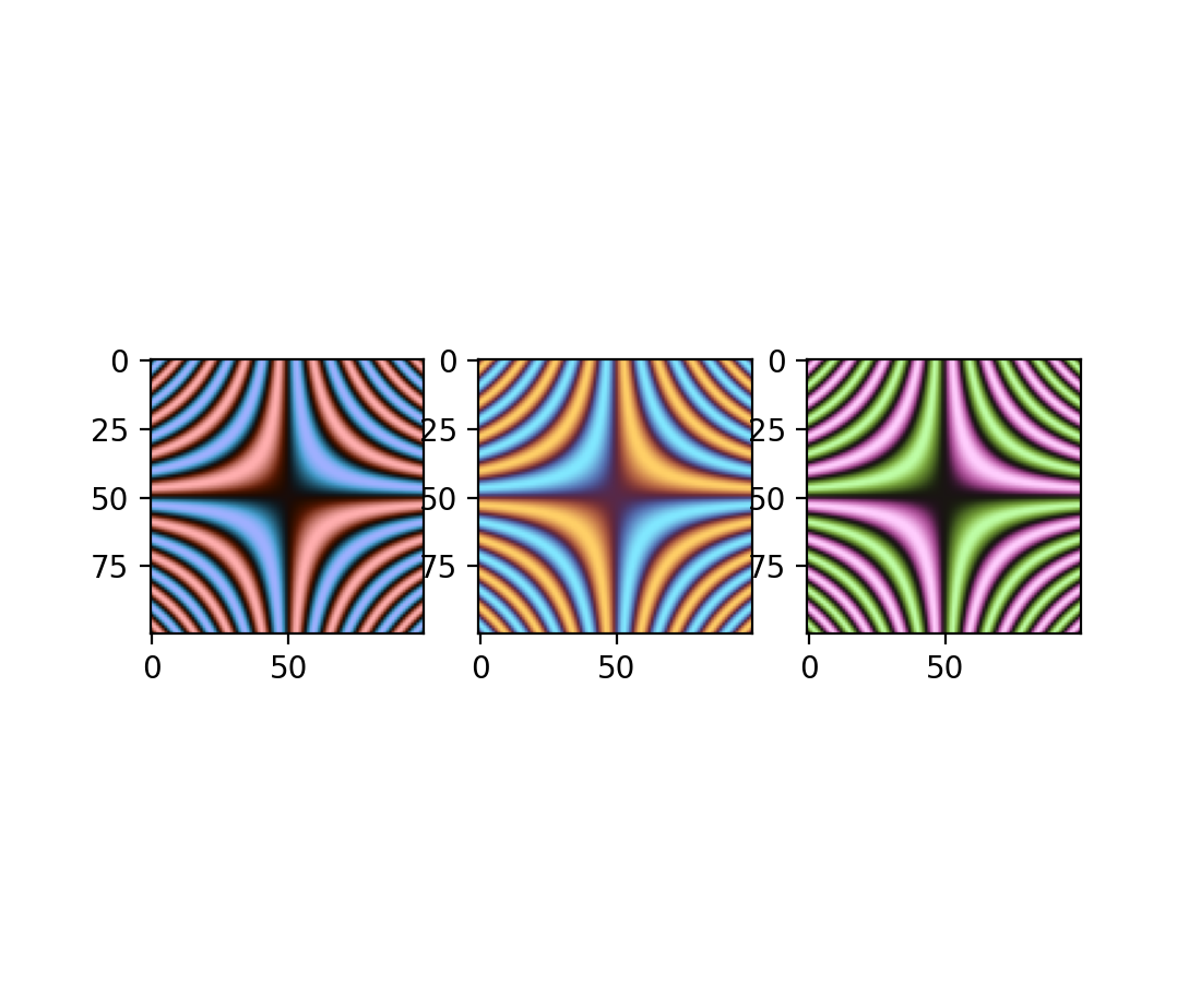
Dark-mode diverging colormaps#
Three diverging colormaps have been added: "berlin", "managua", and "vanimo". They are dark-mode diverging colormaps, with minimum lightness at the center, and maximum at the extremes. These are taken from F. Crameri's Scientific colour maps version 8.0.1 (DOI: https://doi.org/10.5281/zenodo.1243862).
import numpy as np
import matplotlib.pyplot as plt

vals = np.linspace(-5, 5, 100)
x, y = np.meshgrid(vals, vals)
img = np.sin(x*y)

_, ax = plt.subplots(1, 3)
ax[0].imshow(img, cmap=plt.cm.berlin)
ax[1].imshow(img, cmap=plt.cm.managua)
ax[2].imshow(img, cmap=plt.cm.vanimo)
(Source code, 2x.png, png)

Plotting and Annotation improvements#
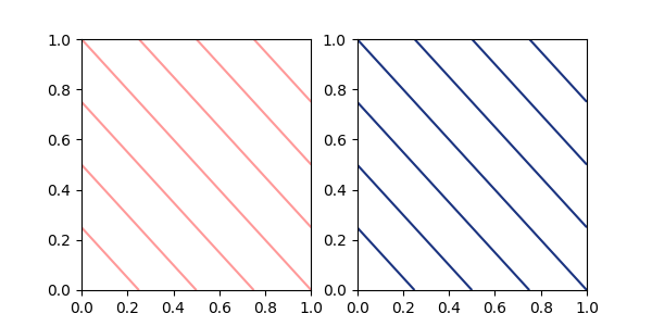
Specifying a single color in contour and contourf#
contour and contourf previously accepted a single color
provided it was expressed as a string. This restriction has now been removed
and a single color in any format described in the Specifying colors tutorial
may be passed.
import matplotlib.pyplot as plt

fig, (ax1, ax2) = plt.subplots(ncols=2, figsize=(6, 3))
z = [[0, 1], [1, 2]]

ax1.contour(z, colors=('r', 0.4))
ax2.contour(z, colors=(0.1, 0.2, 0.5))

plt.show()
(Source code, 2x.png, png)
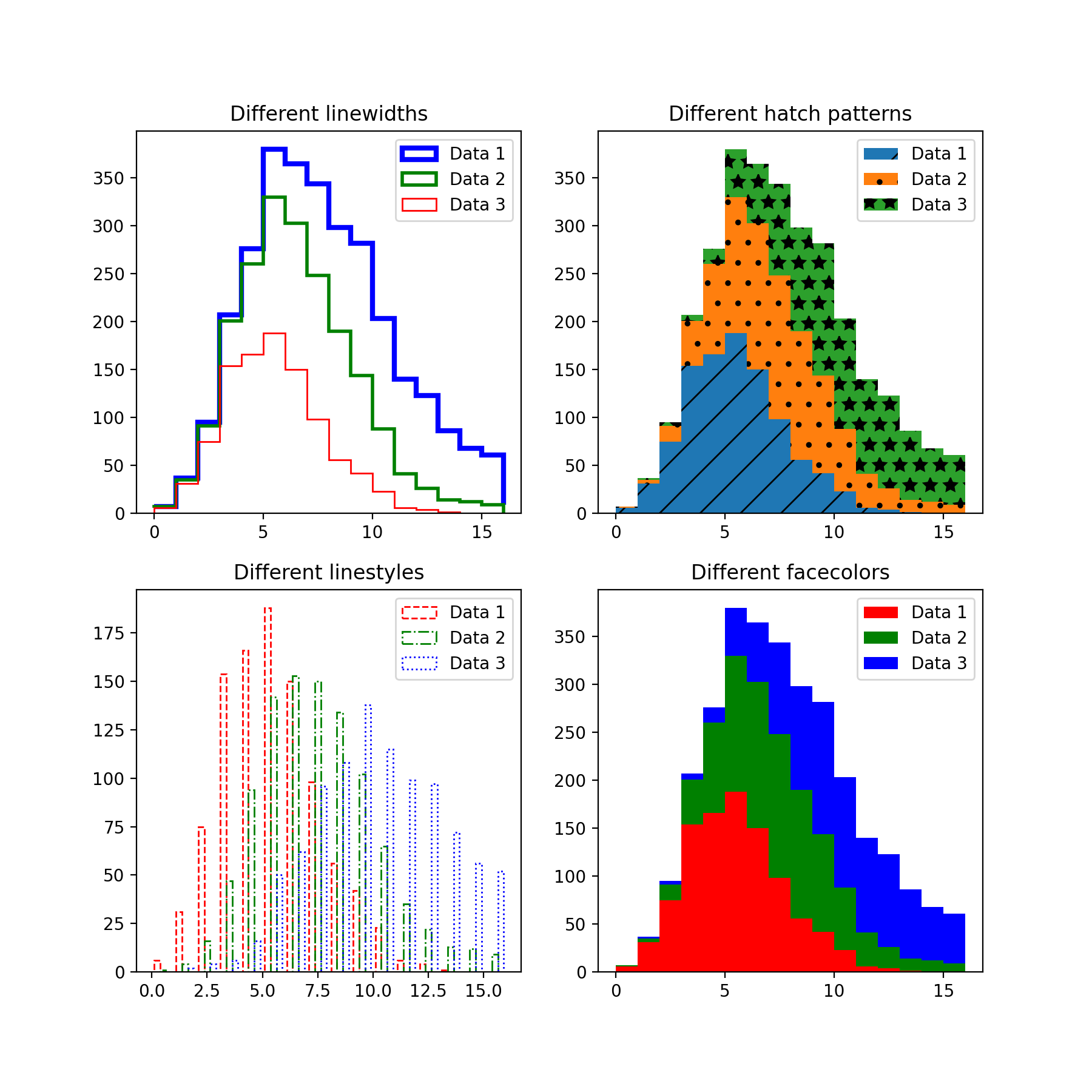
Vectorized hist style parameters#
The parameters hatch, edgecolor, facecolor, linewidth and linestyle
of the hist method are now vectorized.
This means that you can pass in individual parameters for each histogram
when the input x has multiple datasets.
import matplotlib.pyplot as plt
import numpy as np
np.random.seed(19680801)

fig, ((ax1, ax2), (ax3, ax4)) = plt.subplots(2, 2, figsize=(9, 9))

data1 = np.random.poisson(5, 1000)
data2 = np.random.poisson(7, 1000)
data3 = np.random.poisson(10, 1000)

labels = ["Data 1", "Data 2", "Data 3"]

ax1.hist([data1, data2, data3], bins=range(17), histtype="step", stacked=True,
         edgecolor=["red", "green", "blue"], linewidth=[1, 2, 3])
ax1.set_title("Different linewidths")
ax1.legend(labels)

ax2.hist([data1, data2, data3], bins=range(17), histtype="barstacked",
         hatch=["/", ".", "*"])
ax2.set_title("Different hatch patterns")
ax2.legend(labels)

ax3.hist([data1, data2, data3], bins=range(17), histtype="bar", fill=False,
         edgecolor=["red", "green", "blue"], linestyle=["--", "-.", ":"])
ax3.set_title("Different linestyles")
ax3.legend(labels)

ax4.hist([data1, data2, data3], bins=range(17), histtype="barstacked",
         facecolor=["red", "green", "blue"])
ax4.set_title("Different facecolors")
ax4.legend(labels)

plt.show()
(Source code, 2x.png, png)

InsetIndicator artist#
indicate_inset and indicate_inset_zoom now return an instance
of InsetIndicator which contains the rectangle and
connector patches. These patches now update automatically so that
ax.indicate_inset_zoom(ax_inset)
ax_inset.set_xlim(new_lim)
now gives the same result as
ax_inset.set_xlim(new_lim)
ax.indicate_inset_zoom(ax_inset)
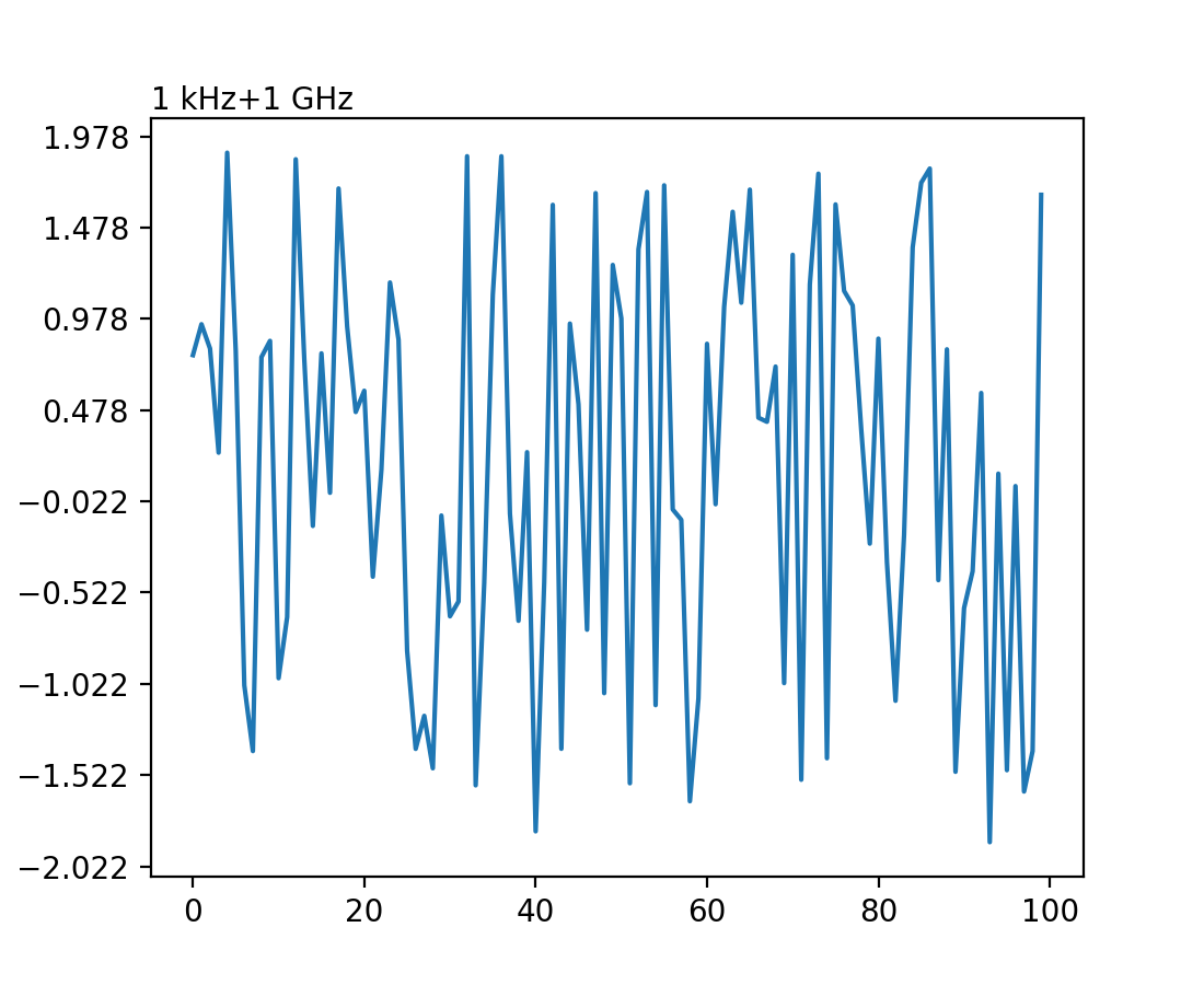
matplotlib.ticker.EngFormatter can computes offsets now#
matplotlib.ticker.EngFormatter has gained the ability to show an offset text near the
axis. Using logic shared with matplotlib.ticker.ScalarFormatter, it is capable of
deciding whether the data qualifies having an offset and show it with an appropriate SI
quantity prefix, and with the supplied unit.
To enable this new behavior, simply pass useOffset=True when you
instantiate matplotlib.ticker.EngFormatter. See example
SI prefixed offsets and natural order of magnitudes.
(Source code, 2x.png, png)
Fix padding of single colorbar for ImageGrid#
ImageGrid with cbar_mode="single" no longer adds the axes_pad between the
axes and the colorbar for cbar_location "left" and "bottom". If desired, add additional spacing
using cbar_pad.
ax.table will accept a pandas DataFrame#
The table method can now accept a Pandas DataFrame for the cellText argument.
import matplotlib.pyplot as plt
import pandas as pd

data = {
    'Letter': ['A', 'B', 'C'],
    'Number': [100, 200, 300]
}

df = pd.DataFrame(data)
fig, ax = plt.subplots()
table = ax.table(df, loc='center')  # or table = ax.table(cellText=df, loc='center')
ax.axis('off')
plt.show()
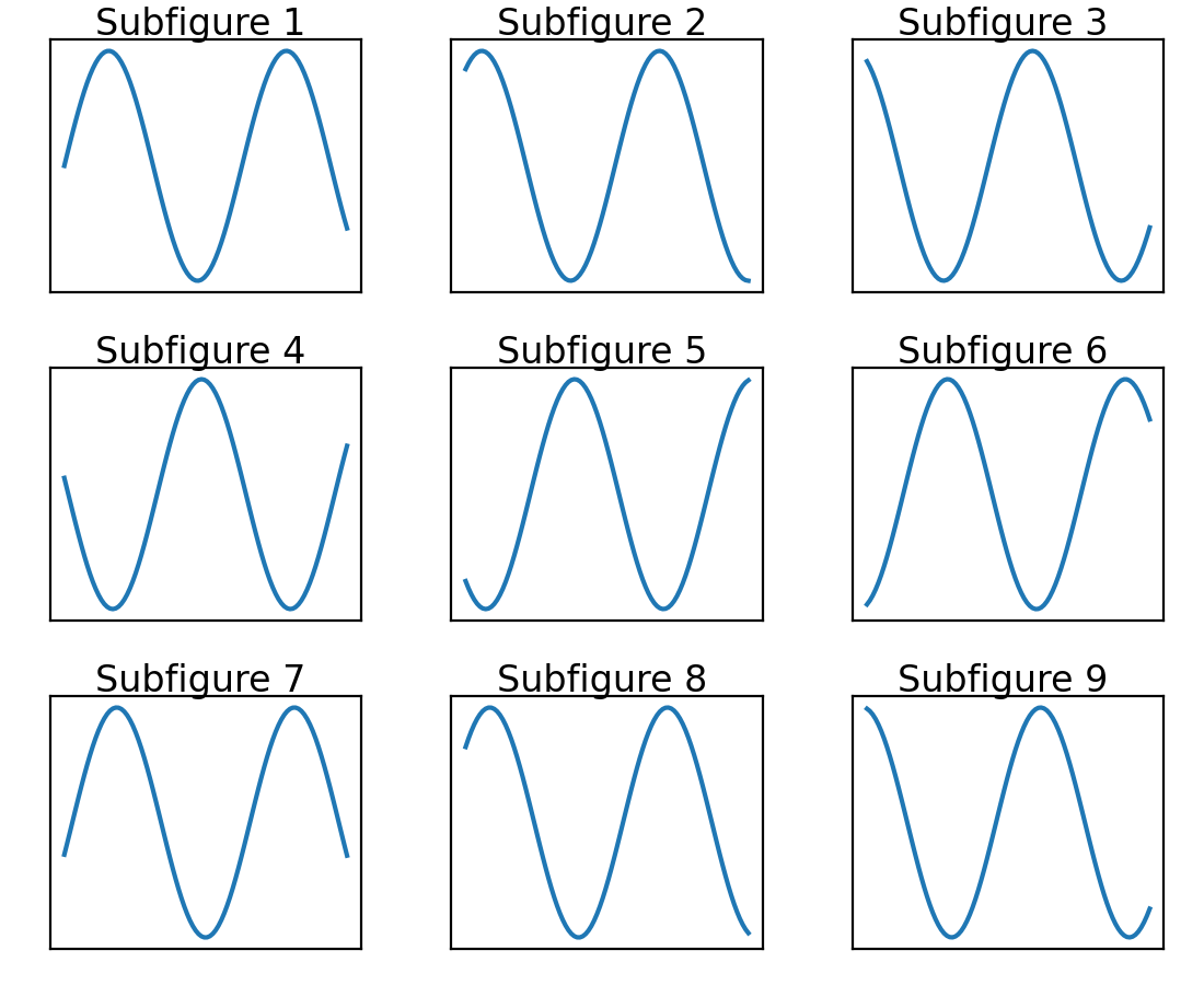
Subfigures are now added in row-major order#
Figure.subfigures are now added in row-major order for API consistency.
import matplotlib.pyplot as plt

fig = plt.figure()
subfigs = fig.subfigures(3, 3)
x = np.linspace(0, 10, 100)

for i, sf in enumerate(fig.subfigs):
    ax = sf.subplots()
    ax.plot(x, np.sin(x + i), label=f'Subfigure {i+1}')
    sf.suptitle(f'Subfigure {i+1}')
    ax.set_xticks([])
    ax.set_yticks([])
plt.show()
(Source code, 2x.png, png)

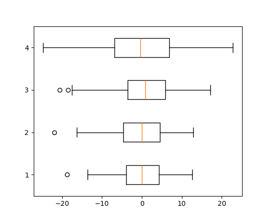
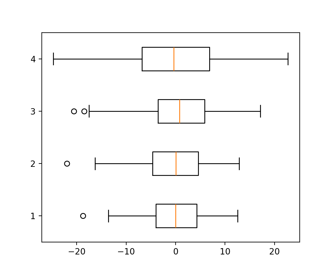
boxplot and bxp orientation parameter#
Boxplots have a new parameter orientation: {"vertical", "horizontal"} to change the orientation of the plot. This replaces the deprecated vert: bool parameter.
import matplotlib.pyplot as plt
import numpy as np

fig, ax = plt.subplots()
np.random.seed(19680801)
all_data = [np.random.normal(0, std, 100) for std in range(6, 10)]

ax.boxplot(all_data, orientation='horizontal')
plt.show()
(Source code, 2x.png, png)
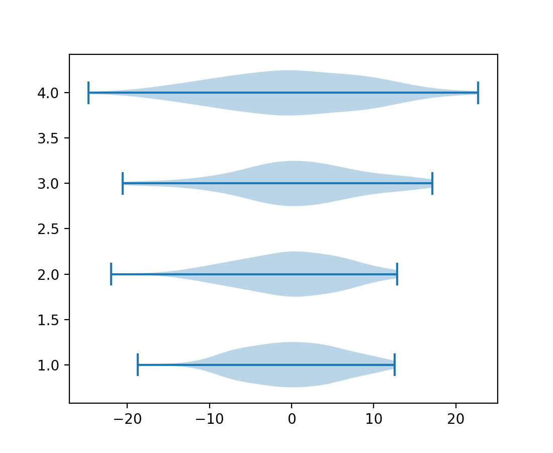
violinplot and violin orientation parameter#
Violinplots have a new parameter orientation: {"vertical", "horizontal"} to change the orientation of the plot. This will replace the deprecated vert: bool parameter.
import matplotlib.pyplot as plt
import numpy as np

fig, ax = plt.subplots()
np.random.seed(19680801)
all_data = [np.random.normal(0, std, 100) for std in range(6, 10)]

ax.violinplot(all_data, orientation='horizontal')
plt.show()
(Source code, 2x.png, png)
FillBetweenPolyCollection#
The new class matplotlib.collections.FillBetweenPolyCollection provides
the set_data method, enabling e.g. resampling
(galleries/event_handling/resample.html).
matplotlib.axes.Axes.fill_between() and
matplotlib.axes.Axes.fill_betweenx() now return this new class.
import numpy as np
from matplotlib import pyplot as plt

t = np.linspace(0, 1)

fig, ax = plt.subplots()
coll = ax.fill_between(t, -t**2, t**2)
fig.savefig("before.png")

coll.set_data(t, -t**4, t**4)
fig.savefig("after.png")
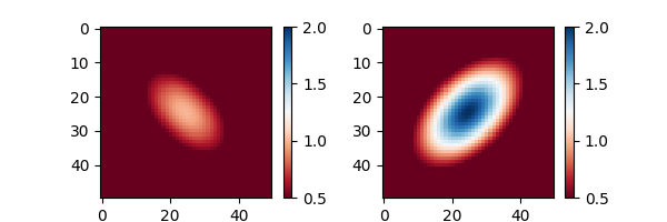
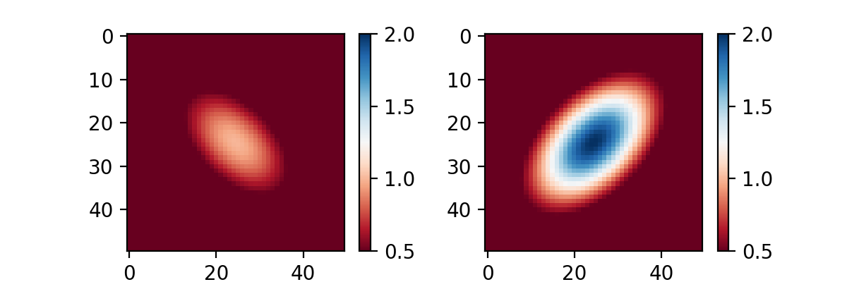
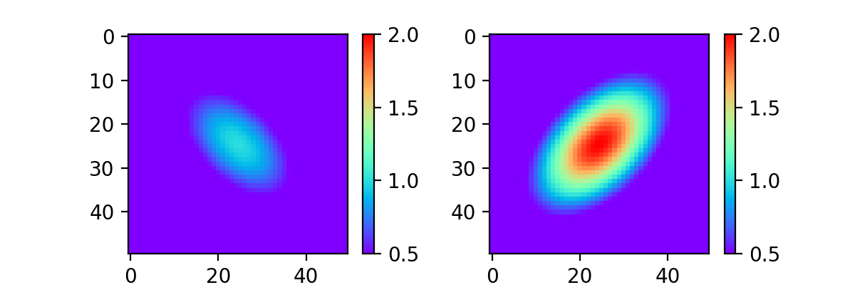
matplotlib.colorizer.Colorizer as container for norm and cmap#
matplotlib.colorizer.Colorizerencapsulates the data-to-color pipeline. It makes reuse of colormapping easier, e.g. across multiple images. Plotting methods that support norm and cmap keyword arguments now also accept a colorizer keyword argument.
In the following example the norm and cmap are changed on multiple plots simultaneously:
import matplotlib.pyplot as plt
import matplotlib as mpl
import numpy as np

x = np.linspace(-2, 2, 50)[np.newaxis, :]
y = np.linspace(-2, 2, 50)[:, np.newaxis]
im_0 = 1 * np.exp( - (x**2 + y**2 - x * y))
im_1 = 2 * np.exp( - (x**2 + y**2 + x * y))

colorizer = mpl.colorizer.Colorizer()
fig, axes = plt.subplots(1, 2, figsize=(6, 2))
cim_0 = axes[0].imshow(im_0, colorizer=colorizer)
fig.colorbar(cim_0)
cim_1 = axes[1].imshow(im_1, colorizer=colorizer)
fig.colorbar(cim_1)

colorizer.vmin = 0.5
colorizer.vmax = 2
colorizer.cmap = 'RdBu'
(Source code, 2x.png, png)
All plotting methods that use a data-to-color pipeline now create a colorizer object if one is not provided. This can be re-used by subsequent artists such that they will share a single data-to-color pipeline:
import matplotlib.pyplot as plt
import matplotlib as mpl
import numpy as np

x = np.linspace(-2, 2, 50)[np.newaxis, :]
y = np.linspace(-2, 2, 50)[:, np.newaxis]
im_0 = 1 * np.exp( - (x**2 + y**2 - x * y))
im_1 = 2 * np.exp( - (x**2 + y**2 + x * y))

fig, axes = plt.subplots(1, 2, figsize=(6, 2))

cim_0 = axes[0].imshow(im_0, cmap='RdBu', vmin=0.5, vmax=2)
fig.colorbar(cim_0)
cim_1 = axes[1].imshow(im_1, colorizer=cim_0.colorizer)
fig.colorbar(cim_1)

cim_1.cmap = 'rainbow'
(Source code, 2x.png, png)
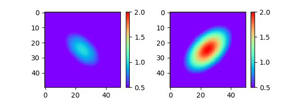
3D plotting improvements#
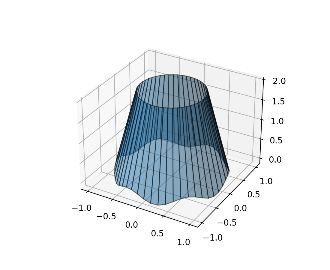
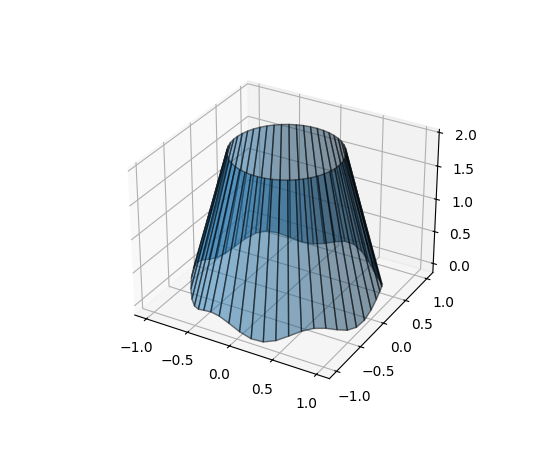
Fill between 3D lines#
The new method Axes3D.fill_between allows to fill the surface between two
3D lines with polygons.
N = 50
theta = np.linspace(0, 2*np.pi, N)

x1 = np.cos(theta)
y1 = np.sin(theta)
z1 = 0.1 * np.sin(6 * theta)

x2 = 0.6 * np.cos(theta)
y2 = 0.6 * np.sin(theta)
z2 = 2  # Note that scalar values work in addition to length N arrays

fig = plt.figure()
ax = fig.add_subplot(projection='3d')
ax.fill_between(x1, y1, z1, x2, y2, z2,
                alpha=0.5, edgecolor='k')
(Source code, 2x.png, png)

Rotating 3d plots with the mouse#
Rotating three-dimensional plots with the mouse has been made more intuitive.
The plot now reacts the same way to mouse movement, independent of the
particular orientation at hand; and it is possible to control all 3 rotational
degrees of freedom (azimuth, elevation, and roll). By default,
it uses a variation on Ken Shoemake's ARCBALL [1].
The particular style of mouse rotation can be set via
rcParams["axes3d.mouserotationstyle"] (default: 'arcball').
See also Rotation with mouse.
To revert to the original mouse rotation style,
create a file matplotlibrc with contents:
axes3d.mouserotationstyle: azel
To try out one of the various mouse rotation styles:
import matplotlib as mpl
mpl.rcParams['axes3d.mouserotationstyle'] = 'trackball'  # 'azel', 'trackball', 'sphere', or 'arcball'

import numpy as np
import matplotlib.pyplot as plt
from matplotlib import cm

ax = plt.figure().add_subplot(projection='3d')

X = np.arange(-5, 5, 0.25)
Y = np.arange(-5, 5, 0.25)
X, Y = np.meshgrid(X, Y)
R = np.sqrt(X**2 + Y**2)
Z = np.sin(R)

surf = ax.plot_surface(X, Y, Z, cmap=cm.coolwarm,
                       linewidth=0, antialiased=False)

plt.show()
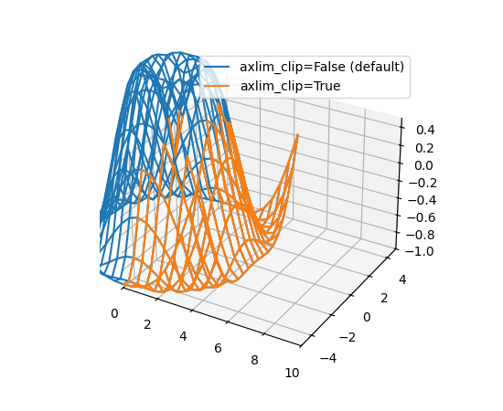
Data in 3D plots can now be dynamically clipped to the axes view limits#
All 3D plotting functions now support the axlim_clip keyword argument, which will clip the data to the axes view limits, hiding all data outside those bounds. This clipping will be dynamically applied in real time while panning and zooming.
Please note that if one vertex of a line segment or 3D patch is clipped, then the entire segment or patch will be hidden. Not being able to show partial lines or patches such that they are "smoothly" cut off at the boundaries of the view box is a limitation of the current renderer.
import matplotlib.pyplot as plt
import numpy as np

fig, ax = plt.subplots(subplot_kw={"projection": "3d"})
x = np.arange(-5, 5, 0.5)
y = np.arange(-5, 5, 0.5)
X, Y = np.meshgrid(x, y)
R = np.sqrt(X**2 + Y**2)
Z = np.sin(R)

# Note that when a line has one vertex outside the view limits, the entire
# line is hidden. The same is true for 3D patches (not shown).
# In this example, data where x < 0 or z > 0.5 is clipped.
ax.plot_wireframe(X, Y, Z, color='C0')
ax.plot_wireframe(X, Y, Z, color='C1', axlim_clip=True)
ax.set(xlim=(0, 10), ylim=(-5, 5), zlim=(-1, 0.5))
ax.legend(['axlim_clip=False (default)', 'axlim_clip=True'])
(Source code, 2x.png, png)

Preliminary support for free-threaded CPython 3.13#
Matplotlib 3.10 has preliminary support for the free-threaded build of CPython 3.13. See https://py-free-threading.github.io, PEP 703 and the CPython 3.13 release notes for more detail about free-threaded Python.
Support for free-threaded Python does not mean that Matplotlib is wholly thread safe. We
expect that use of a Figure within a single thread will work, and though input data is
usually copied, modification of data objects used for a plot from another thread may
cause inconsistencies in cases where it is not. Use of any global state (such as the
pyplot module) is highly discouraged and unlikely to work consistently. Also note
that most GUI toolkits expect to run on the main thread, so interactive usage may be
limited or unsupported from other threads.
If you are interested in free-threaded Python, for example because you have a multiprocessing-based workflow that you are interested in running with Python threads, we encourage testing and experimentation. If you run into problems that you suspect are because of Matplotlib, please open an issue, checking first if the bug also occurs in the “regular” non-free-threaded CPython 3.13 build.
Other Improvements#
svg.id rcParam#
rcParams["svg.id"] (default: None) lets you insert an id attribute into the top-level <svg> tag.
e.g. rcParams["svg.id"] = "svg1" results in
<svg
    xmlns:xlink="http://www.w3.org/1999/xlink"
    width="50pt" height="50pt"
    viewBox="0 0 50 50"
    xmlns="http://www.w3.org/2000/svg"
    version="1.1"
    id="svg1"
></svg>
This is useful if you would like to link the entire matplotlib SVG file within
another SVG file with the <use> tag.
<svg>
<use
    width="50" height="50"
    xlink:href="mpl.svg#svg1" id="use1"
    x="0" y="0"
/></svg>
Where the #svg1 indicator will now refer to the top level <svg> tag, and
will hence result in the inclusion of the entire file.
By default, no id tag is included.
Exception handling control#
The exception raised when an invalid keyword parameter is passed now includes
that parameter name as the exception's name property. This provides more
control for exception handling:
import matplotlib.pyplot as plt

def wobbly_plot(args, **kwargs):
    w = kwargs.pop('wobble_factor', None)

    try:
        plt.plot(args, **kwargs)
    except AttributeError as e:
        raise AttributeError(f'wobbly_plot does not take parameter {e.name}') from e


wobbly_plot([0, 1], wibble_factor=5)
AttributeError: wobbly_plot does not take parameter wibble_factor
Increased Figure limits with Agg renderer#
Figures using the Agg renderer are now limited to 2**23 pixels in each direction, instead of 2**16. Additionally, bugs that caused artists to not render past 2**15 pixels horizontally have been fixed.
Note that if you are using a GUI backend, it may have its own smaller limits (which may themselves depend on screen size.)
Miscellaneous Changes#
The
matplotlib.ticker.ScalarFormatterclass has gained a new instantiating parameterusetex.Creating an Axes is now 20-25% faster due to internal optimizations.
The API on
Figure.subfiguresandSubFigureare now considered stable.